ds4ad
Adding Meaning to Plots
Let’s load our libraries and use our previous fake data.
import matplotlib.pyplot as plt
import pandas as pd
%matplotlib inline

df1 = pd.DataFrame({'time': [0, 1, 2, 3, 4, 5],
                    'distance': [0, 100, 200, 300, 400, 500]},
                  index=[0, 1, 2, 3, 4, 5])

df2 = pd.DataFrame({'time': [0, 1, 2, 3, 4, 5],
                    'distance': [500, 400, 300, 200, 100, 0]},
                    index=[0, 1, 2, 3, 4, 5])
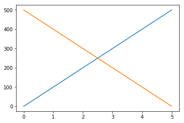
Start with our canvas using the two data frames.
plt.plot('time', 'distance', data= df1)
plt.plot('time', 'distance', data= df2)
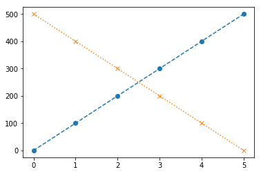
We can set some parameters for each graph, refer to plt.plot? for specifics. For this example we will set the markerand linestyle.
plt.plot('time', 'distance', data= df1, marker='o', linestyle= 'dashed')
plt.plot('time', 'distance', data= df2, marker= 'x', linestyle= 'dotted')
Exercise
check the plt.plot documentation and change the colors of these two plots.
Solution
plt.plot('time', 'distance', data= df1, marker='o', linestyle= 'dashed', color='r')
plt.plot('time', 'distance', data= df2, marker= 'x', linestyle= 'dotted', color='b')
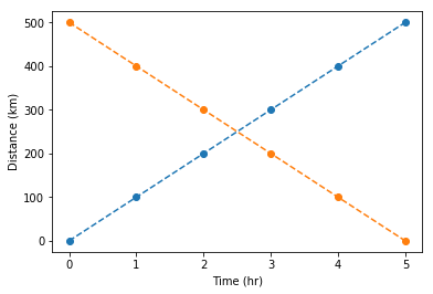
Plot axis labels
We can set our axes labels directly using plt.xlabel and plt.ylabel.
plt.plot('time', 'distance', data = df1, marker= 'o', linestyle= 'dashed')
plt.plot('time', 'distance', data = df2, marker= 'o', linestyle= 'dashed')
plt.xlabel('Time (hr)')
plt.ylabel('Distance (km)')
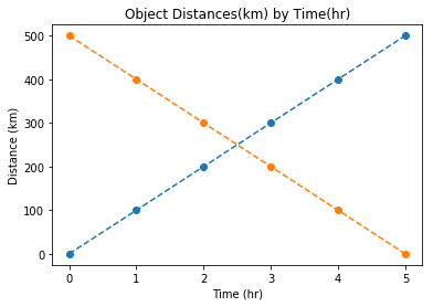
We can add a title using plt.title.
plt.plot('time', 'distance', data = df1, marker= 'o', linestyle= 'dashed')
plt.plot('time', 'distance', data = df2, marker= 'o', linestyle= 'dashed')
plt.xlabel('Time (hr)')
plt.ylabel('Distance (km)')
plt.title('Object Distances(km) by Time(hr)')
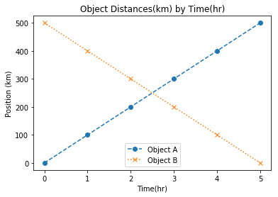
we can add a legend by adding label to our plots and plt.legend.
plt.plot('time', 'distance', data=df1, marker = 'o', linestyle = 'dashed', label = 'Object A')
plt.plot('time', 'distance', data=df2, marker = 'x', linestyle = 'dotted', label = 'Object B')
plt.xlabel('Time(hr)')
plt.ylabel('Position (km)')
plt.title('Object Distances(km) by Time(hr)')
plt.legend(loc='lower center')
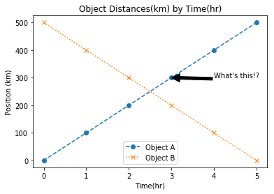
If we wanted to annotate our plot we can use plt.annotate.
plt.plot('time', 'distance', data=df1, marker = 'o', linestyle = 'dashed', label = 'Object A')
plt.plot('time', 'distance', data=df2, marker = 'x', linestyle = 'dotted', label = 'Object B')
plt.title('Object Distances(km) by Time(hr)')
plt.xlabel('Time(hr)')
plt.ylabel('Position (km)')
plt.legend(loc='lower center')
plt.annotate("What's this!?", xy=(3, 300), xytext=(3+1, 300+1), arrowprops=dict(facecolor='black'))