ds4ad
Plot data directly from a Pandas dataframe.
import pandas as pd
df3 = pandas.read_csv('https://raw.githubusercontent.com/uwescience/ds4ad/master/data/synthetic_data.csv',index_col='rec_id')
print(df3.describe())
Often times you want to look at column distributions and behavior visually. Using pandas.DataFrame.plot() directly facilitates that and uses matplotlib/pyplot.
You can access data frame columns directly like before in pandas notation followed by the .plot.
You set the kind of plot you want by setting the kind parameter accordingly.
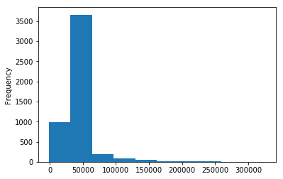
This gives us a histogram of the column salary.
df3["salary"].plot(kind='hist')
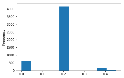
This gives us a histogram of the column tax_rate.
df3["tax_rate"].plot(kind='hist')
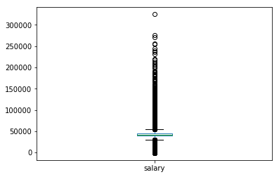
You can get boxplots by setting the kind parameter to ‘box’.
df3['salary'].plot(kind = 'box')
Exercise:
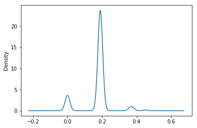
Plot the density of the column ‘tax_rate’.
Hint: Look at the pandas.DataFrame.plot documentation for reference.
Solution
df3['tax_rate'].plot(kind = 'density')
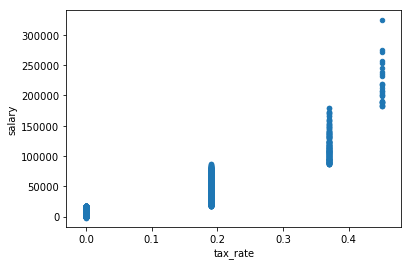
You can plot multiple columns by specifying them inside .plot.
df3.plot('tax_rate','salary', kind = 'scatter')
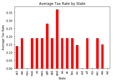
Plotting grouped data frame calculations
Often times you will summarize your data in a variety of ways and will want to represent that information visually.
state_tax_mean = df3.groupby(['state'])['tax_rate'].mean()
This returns a series, and a series can be directly used with .plot.
state_tax_mean.plot(kind='bar', color='r')
plt.title('Average Tax Rate by State')
plt.xlabel('State')
plt.ylabel('Average Tax Rate')
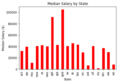
Exercise
Calculate the median salary by state and create a plot with all the appropriate labels.
Solution
state_md_salary = df3.groupby(['state'])['salary'].median()
state_md.plot(kind='bar', color='r')
plt.title('Median Salary by State')
plt.xlabel('State')
plt.ylabel('Median Salary ($)')