ORCA: Trying to understand bias in ORCA data
This past week the ORCA team started to tackle the question of bias mentioned in our previous blog post. As Sean elucidated in his overview of the ORCA team’s project charter there are three main sources of bias we feel are both substantively important, and practically feasible, to investigate during this summer program. We decided to start with the second level of bias, the differences between ORCA tap counts and Automatic Passenger Count (APC) data, focusing first and foremost on Pierce and Community Transit due to the full coverage of APC gauges on their vehicle fleets. While this is the most straightforward analysis of the three, attempting to say something basic about the differences between ORCA and APC counts of ridership underscored the iterative nature of research, especially given such large and complex datasets.
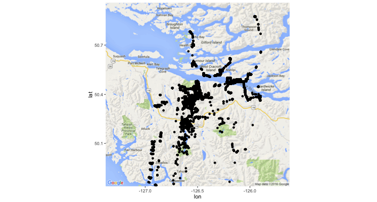 One of the major obstacles our team encountered when looking at the Community Transit data came in the initial stages of simply visualizing the location of bus stops on a map. The image on the right shows the result of our endeavor, which erroneously plotted stops all across Vancouver Island. After many attempts at trying to correct the problem by reprojecting the data, the fellows working with these data were able to move forward with their analysis by pulling in geographic data from a different, but reliable, data source. The issue is currently being further investigated by our computer support analyst to determine the specific source of the problem.
 While Pierce Transit does not have the same geography issues as the Community Transit data, both datasets produced suspicious distributions of the difference between ORCA and APC boardings. Given that APC includes ORCA users as well as all other forms of ridership (e.g. those paying with cash or using vouchers, individuals allowed to board at the driver’s discretion, etc.), we would expect to see a larger amount of APC boardings relative to ORCA. As evidenced by the figure on the left, while the majority of stops did comport with this intuition, close to 5% of all stops counted more ORCA taps than people boarding the bus! Since this is technically a physical impossibility, we have since begun an investigation into possible causes for these ORCA overcounts. Our team has delineated several potential sources of error in the data: the APC gauge itself could be working improperly leading to an incorrect count of the “true” boardings at an individual stop; passengers don’t always tap their card upon initial entry into the vehicle (e.g. when they can’t find their card, don’t have it ready to tap, etc.), which would result in a boarding tap being allocated to a stop further along a route than the stop at which they actually boarded; the allocation of an ORCA boarding to a stop (which happens on the data processing side) could be misattributing ORCA boardings to the wrong stops. This last potential source of spuriousness is obviously the most concerning to us since it is the only one we have control over and is a product of data manipulation, not an inherent part of the datasets. We are therefore trying to assess how accurate this allocation process is and what potential situations might be causing it to misallocate ORCA boardings.
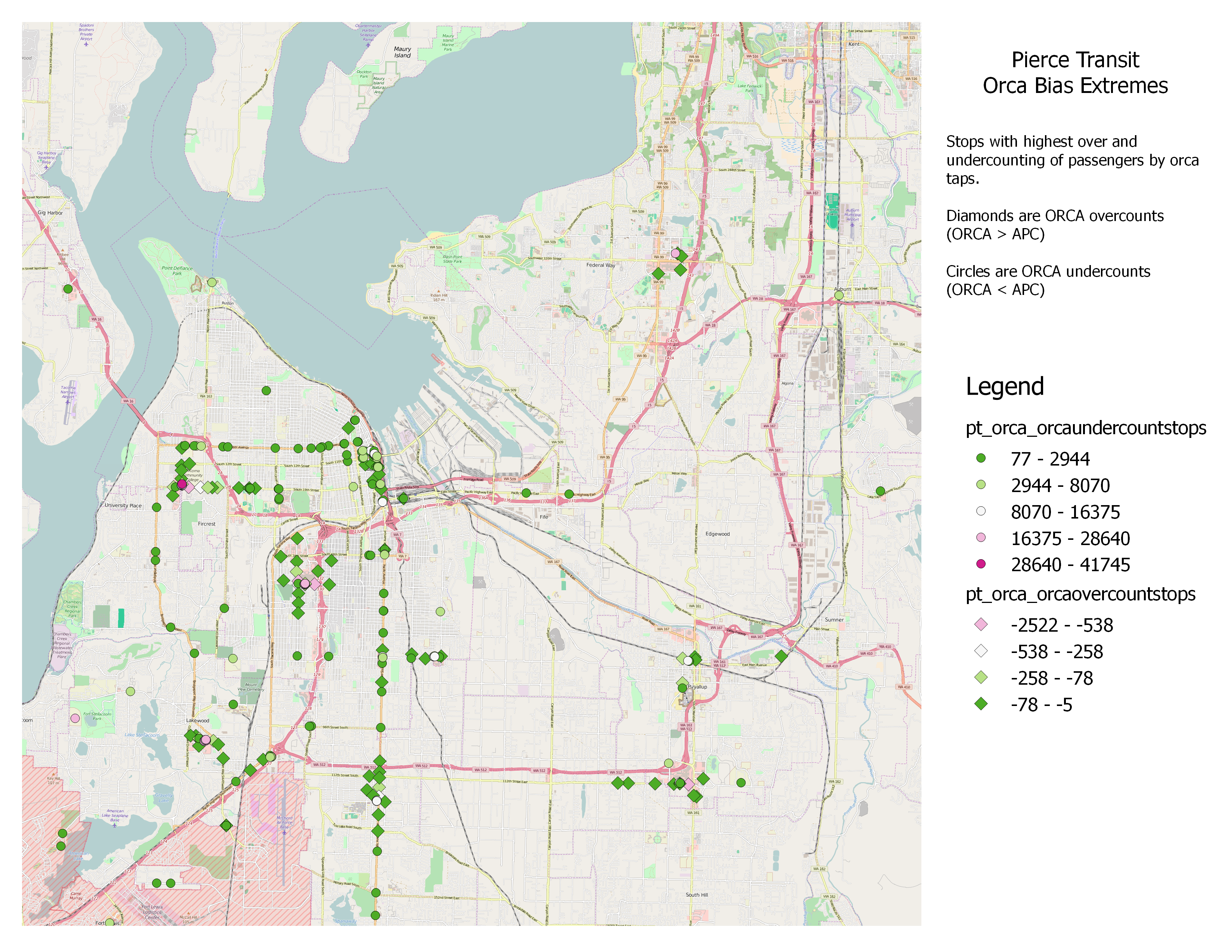 To that end we have spent this past week working on a few different methods which will hopefully allow us to make sense of some of the noise we are currently encountering in the data. Firstly, as the plot on the left shows, the relationship between the location of ORCA over- and undercounts appears to be spatially related. This would lend credence to the theory that there is a misallocation of stops happening either at the passenger-level or through the preprocessing phase of data manipulation. As such we are currently attempting to create a moving window along routes to help smooth out the level of noise currently caused by the extreme granularity of stop-level data. Additionally, we are attempting to geographically contextualize these data by determining an appropriate clustering algorithm which would group certain transit hubs (e.g. universities, malls, transit centers) as one major “stop.” More than simply reducing unexplained variation at the stop level this second technique will also help with our future social science analyses since we will have a better understanding of origin and destination pairs and transfer patterns.
These past two weeks have probably introduced more questions than answers but these puzzles have also allowed us to learn new skills, methods, and ways of interacting with large data sets. We have been challenged to come up with creative paths forward when things did not turn out the way we initially anticipated and we are excited to see what surprises the data have in store for us in the future!