ORCA: Fifty Shades of Biases
As discussed in our previous post, there are three main forms of potential bias which could limit ORCA data’s usefulness in informing transit planning: 1) ORCA vs. APC (automatic passenger count)/ridership. If some routes/time/stops have a higher percentage of passengers using ORCA card, then those routes/time/stops would be more influential when ORCA card data are used for planning purposes, which would introduce bias 2) APC vs. ridership, due to the fact that only a proportion of King County Metro buses have APC counts. If some routes/stops have a higher percentage of journeys with APC counts, then those routes/stops would be more influential when APC is used for planning purposes 3) ridership vs. the population of Puget Sound. If some communities currently have more bus usage, then those communities are more likely to be overrepresented in our data, thus have a higher weight in planning decision making. For equity purposes, the ORCA team would like to understand those biases before we make suggestions for planning based on ORCA and APC data.
Bias #1 ORCA vs. APC/Ridership
In the past two weeks, our group has been actively working on data wrangling to merge ORCA tap data with APC data. The success of those attempts are especially important in addressing bias #1 and will be described in detail in a blogpost later.
One of the ways to compare ORCA to APC/Ridership is to spatially aggregate ORCA data to the census tract and compare that with, for instance, ridership estimates from the American Community Survey (ACS).
For instance, below is a graph illustrating the percentage of workers within each census tract reporting taking public transportation to go to work according to ACS.
And below is a graph illustrating the logged total number of ORCA taps between Tuesday and Thursday for our entire 9 week period for each tract.
While this is not a direct comparison, since ORCA data include the transit data of all individuals (not only workers) commuting for all purposes, and ACS data comes in percentages, it can be seen that overall, tracts with more ORCA taps also tend to have a higher percentage of workers reporting taking public transportation. A more direct comparison (i.e. between ORCA and APC) would be preferable.
Bias #2 APC vs. ridership
Since for King County Metro only a proportion of the buses have APC counts, in order to be able to use APC as our ground truth, we need to understand whether APC is representatively sampled across space and time.
From talking to our project lead and transit agencies, we learned that APC sensors, which are attached to buses themselves, are never moved. Instead, buses with sensors are dispatched on different routes in an effort to get ridership estimates for all routes for the transit agencies (KCM). We also learned that this strategic dispatch happens mostly during weekdays.
Equipped with that knowledge, we analyzed weekdays and weekends separately. On average 30.41% of the journeys on weekdays have APC counts, and 30.94% of the journeys on weekends have APC counts, this is higher than we originally expect.
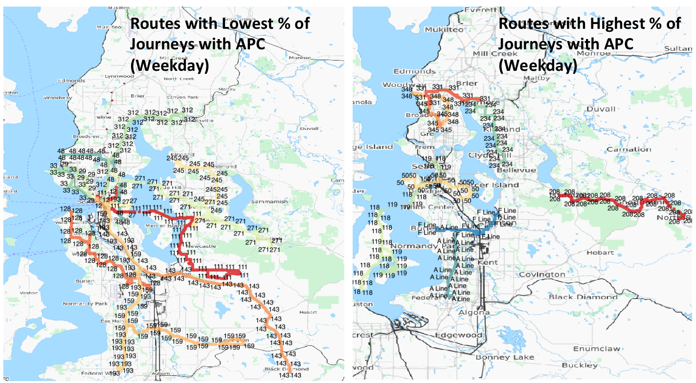 Next we look at the distribution of those journeys with APC counts on WEEKDAYS. Due to the fact that some routes have more journeys than others, we calculated the percentage of journeys with APC for each route. Eleven routes with the most and least percentage of journeys with APC are shown in the figure. As can be observed from the figure, KCM routes with the highest percentage of the journeys with APC data are the Sound Transit routes, the rapid ride lines (all rapid rides have high percentage of journeys with APC, didn’t plot them all on the map to avoid overplotting), and the KCM routes closer to the northern base. And KCM routes with the lowest percentage of journeys with APC counts are school buses (not plotted), temporary buses, and buses closer to the southern base.
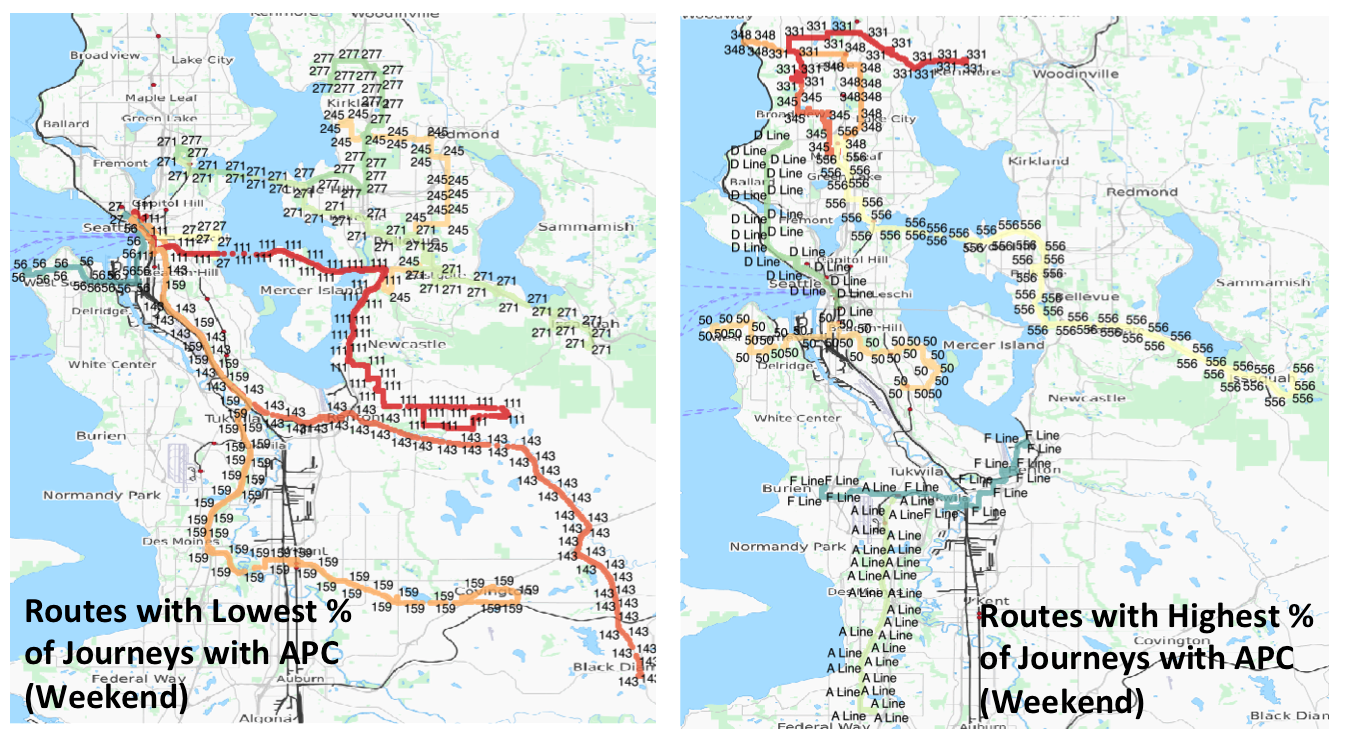 Similarly, we plotted the distribution of journeys with APC per route on WEEKENDS. A similar pattens emerge, rapid rides and buses leaving from the north base have high percentage of journeys with APC, while buses leaving from the south base have lower percentage of journeys with APC.
Is APC count representatively sampling journeys across routes? The above analysis suggests that the answer is no. While some routes have over 80% of the journeys with APC data, others have as low as 3% through our 9 weeks of data recording. The factors that are contributing the most seem to be the type of bus (whether rapid ride etc.), the transit agency (whether Sound Transit), as well as the base where the bus departs from (northern basis seem to have higher % of journeys with APC count data).
As newer buses on average are more likely to have APC devices, this pattern also implies that regular buses (not including rapid rides and sound transit)operating in northern Seattle area tend to be newer than those operating in the south, which points to directions for bus updating.
The past two weeks we have made exciting progress both in terms of data wrangling (will be discussed in the next post), as well as substantive progress in understanding bias. However, our understanding of bias in the data is far from complete. One potential next step is to model the bias using fixed effect models, as well as using predictors in the ACS dataset. The team is looking forward to the insights bias analyses provide in designing our final dashboard.