Tools
We leveraged tools including the Heat Pump Calculator developed by energy specialist Alan Mitchell, Google Earth Engine (GEE), the D’hondt method implemented in Python, and a number of visualization packages in both Python and R.
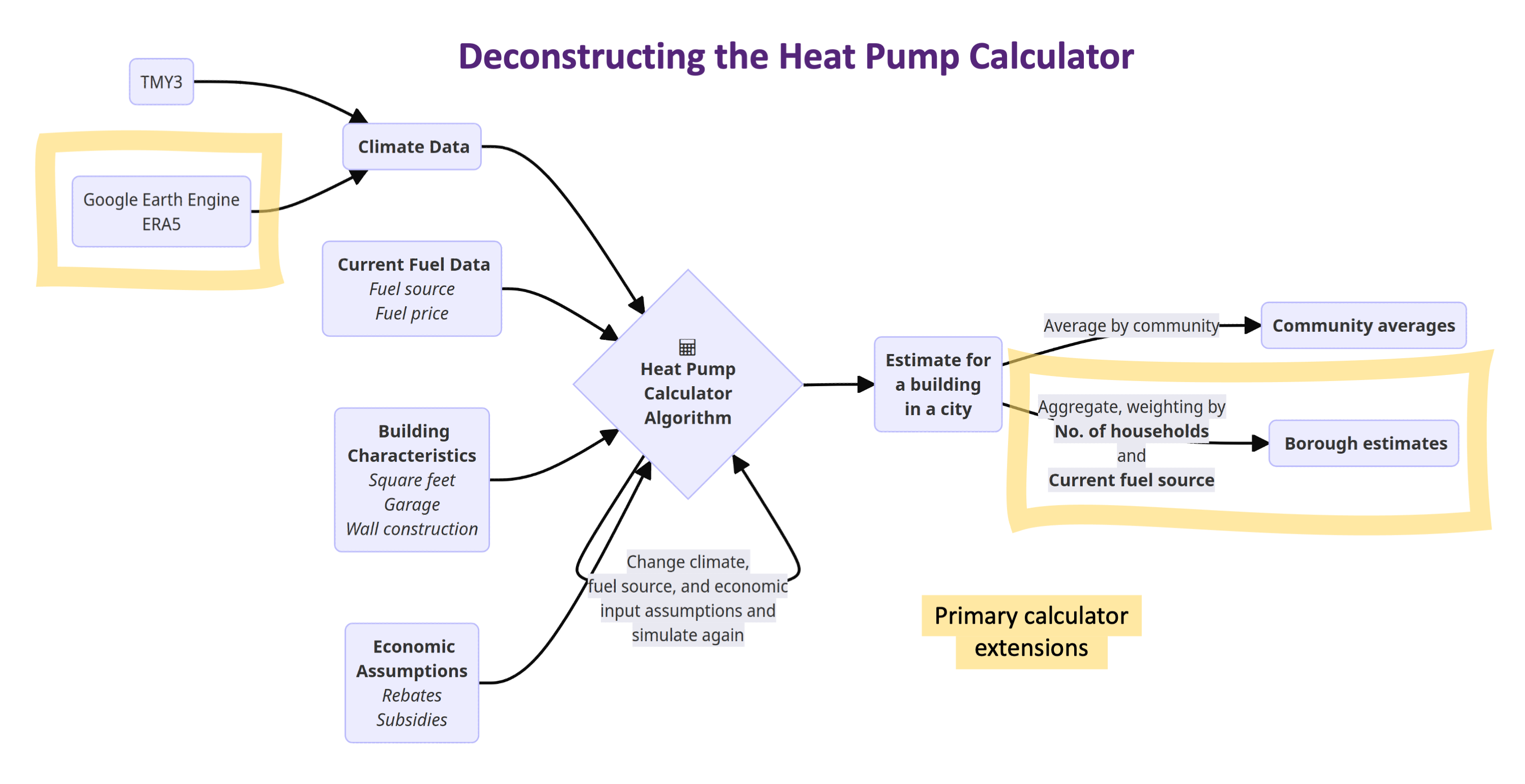
Heat Pump Calculator
The Heat Pump Calculator (the “Calculator”) is developed by energy specialist Alan Mitchell at Analysis North. It is an open source tool that helps individual homeowners to estimate the energy and cost savings from retrofitting a heat pump in Alaska. The Calculator takes a wide range of variables as input that are specific to the users’ locality. These include four major categories of inputs: climate data, current fuel data, economic assumptions, and building characteristics.
Input variables
First, the outside temperature critically determines the efficiency, and hence feasibility, of a heat pump. So, the Calculator uses hourly temperature data specific to a neighborhood to compute the efficiency of a heat pump. The current data source it uses is TMY 3 weather data, whose granularity is less than ideal and contains only 73 points of observation (compared to 277 cities that are used as the basis of simulation).
Apart from outside temperature, the economic savings of retrofitting a heat pump depends predominantly on the users’ current home heating fuel consumption: if they are primarily using fossil fuels (e.g., natural gas) that are cheap in their localities compared to the electricity rate, this severely undermines the economic viability of a heat pump. So, the Calculator takes into account fuel and electricity prices from the most current AkWarm Home Energy Rating Library (updated every 6 months) when computing the economic savings from retrofitting a heat pump.
Relatedly, many economic variables are not static and are subject to change over the “lifespan” of a heat pump (which is 14 years on average). In particular, the annual escalation rate of fuel prices and electricity prices, the level of government subsidies, and the installation cost of a heat pump (which is significantly higher in rural areas) are some examples of important economic assumptions that the users need to specify in order to make accurate estimations.
There are other auxiliary input variables that are required for the estimation, chiefly about the building characteristics of a unit. Examples include the floor area, the level of insulation, and the number of garages. This category of inputs is not the major focus of our study, so we stick with the sensible defaults provided in the Calculator.
Extending the Calculator
The Calculator is a powerful and flexible tool, yet we observe two problems in its application. Mostly significantly, its modeling realism can strike users as being overly technical. We believe it is important to communicate the estimates (using sensible defaults) from the Calculator in a more accessible manner, so visualization is a key component of our project (see Visualization part in the Analyses section). In addition, the flexibility of the Calculator can be further exploited to simulate a wide range of scenarios. This property, coupled with interactivity (see Visualization), is useful as users are not dictated by the defaults we impose, but instead can explore different scenarios as they desire. Similarly, it is useful for implementing future projections: What if fuel prices increase in the future? What if government subsidies increase substantively, like under the Inflation Reduction Act? We can harness the power of the Calculator and conduct simulations for over 20,000 times to enable such user interactivity and future projections.
We revise the source code of the Calculator and perform simulations across different scenarios. All the code and associated changes are documented on our GitHub repository.
Moreover, the estimates coming from the Calculator are at a building level. To make them more relevant from a policy perspective, we need to aggregate the results to a community level that is meaningful. We choose to aggregate the estimates to a borough level because we believe it is the most policy relevant unit. Please read our Analyses section for more information.
Below is the diagram of our workflow in deconstructing and improving on the Calculator, highlighting our contributions in yellow:
Google Earth Engine
GEE is a cloud-based geospatial analysis platform that enabled us to integrate, analyze, and visualize satellite images of Alaska via the Python API. GEE’s data catalog includes ERA5 data. We worked primarily with daily aggregates to create 10 year averages (2010 to 2019) of the maximum, minimum, and mean daily temperatures for each unit of analysis. In some cases, we also pulled hourly 10 year averages. We first obtained temperature data from the land-specific dataset because the land data has the highest resolution. If temperature data was unavailable for a specific region, we then drew from the general ERA5 data which covers the whole world at a lower resolution.
Granular temperature data empowers a more precise estimation of the energy saving by a heat pump. That estimation is currently handled by the Heat Pump Calculator, developed by an energy specialist in collaboration with other local Alaskan stakeholders. The calculator allows users to evaluate the possible energy and cost savings from the use of a single air source heat pump in individual buildings across Alaska. Users input detailed information about the building including location, square footage, insulation levels, current fuel and energy consumption, and more. We used the heat pump calculator’s algorithm as the foundation for estimating our outcomes of interest and projecting macro-trends. We altered the algorithm to calculate heat pump efficiency at a daily level using the ERA5 temperature data. This offers a significant improvement in the granularity of data when compared to data used in the prevailing tools. For example, the default temperature data used in the Heat Pump Calculator includes approximately 70 regions, while our analysis uses approximately 12,000 regions. This substitution allowed for a higher level of precision and a more accurate reflection of the current and historical temperature trends.
To imagine what heat pump distribution could look like across the state of Alaska, we needed an algorithm that allowed us to distribute heat pumps proportionally at the borough level. We believe that proportional distribution of heat pumps according to some measure is a more realistic scenario than equal distribution across all boroughs. The D’hondt method is an apportionment method developed to distribute seats in a legislative body proportionally to some measure, typically votes or population. Different apportionment methods have been developed because exact proportionally is often not possible due to the issue of fractional seats. These different methods have different properties, and empirical studies show that the D’hondt method is one of the least proportional apportionment methods, favoring large parties with the most votes. We determined that this property does not present concerns for our application, and might even be favorable depending on the measure we chose to distribute heat pumps proportionally to (see the discussion below in Analyses).
Visualization tools
Our work was completed primarily in Python with interactive visual displays created in R. Python code was developed in Jupyter Notebooks and documented on our GitHub repository. We used Shiny and plotly packages in R to develop our interactive visual tool, which is hosted on shinyapps.io/ (see more in the Visualization part of our Analyses section.