Analyses
Workflow
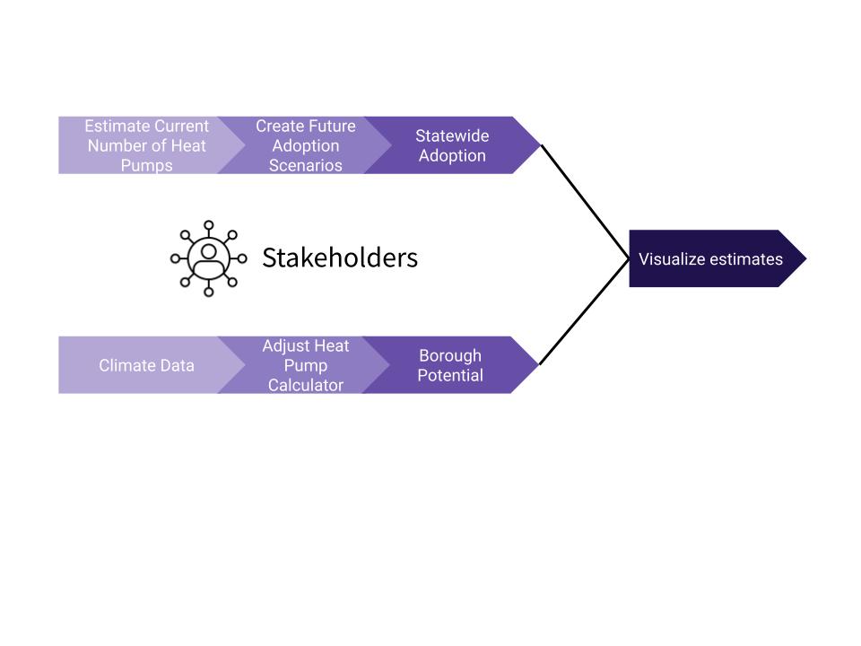
Our project was comprised of two parallel workflows. The first explores statewide adoption and makes unchanging assumptions about the world we live in today. For adoption, we’re interested in knowing where heat pumps are now, where they will likely be in the future, in quantifying the opportunity gap between the two. Our second goal is borough potential and is associated with changing and interacting assumptions. Here, we investigate heat pump potential given different fossil fuel price scenarios, government subsidies, and varying levels of climate change.
Aggregation
We chose to aggregate temperature data by Census blocks for our estimation. We pursue aggregation because it enables us to discuss the results and draw policy conclusions in interpretable units of analysis. Also, it reduces the load of computation as we don’t have to conduct simulations across tens of thousands of ERA5 raster points.
Blocks are the smallest unit of observation that partitions Alaska into 28,568 non-overlapping units with an average size of 11 households per block. This provides us with a unit of observation that matches with the granularity of our ERA5 temperature data. We can easily aggregate blocks into bigger administrative units, such as boroughs, because they all have interoperable identification codes (FIPS). Therefore, our workflow will allow analysis at each of the different levels of administrative boundaries. Due to our focus on macro-trends, our visualizations primarily present borough-level analyses, but we do show an analysis of the blocks within the borough of Juneau as a case study.
There are many ways to reduce raster temperature data according to other vectors. H3 (Hexagonal hierarchical geospatial indexing system) is an alternative option we considered. Its chief advantage is that “indexed data can be quickly joined across disparate datasets and aggregated at different levels of precision” with different resolutions of hexagons. However, we chose not to pursue this approach because hexagons are not socio-politically meaningful to wide audiences and create additional complications compared to census units.
Adoption
We described above the algorithm for distributing heat pumps by borough across the state of Alaska, but even with that choice we still had key analytical decisions to make regarding the structure of different adoption scenarios. Specifically, how many heat pumps can we imagine Alaska having ten years into the future, and what measure should we use to distribute heat pumps across the state?
We chose to investigate two adoption scenarios. These adoption scenarios are imagining exercises that answer the question, “What if a certain percentage of Alaska adopted heat pumps in the next ten years?” and are not meant to be accurate predictions. With this goal in mind, we do our best to make simple and realistic assumptions. To begin, we decided on two adoption goals: 5% of housing units with heat pumps and 15% of housing units with heat pumps. We estimate that about 1% of housing units currently have heat pumps and believe that 5% is a realistic goal number for the next ten years. We chose 15% for the second scenario to match the national average of heat pump adoption in the United States.
We used the D’hondt method to distribute heat pumps by borough in Alaska according to heat pump efficiency and population. We recognize that there are many factors that contribute to whether or not a heat pump is installed, but we believe the most important factor is feasibility, or how well a heat pump can actually heat a space. We used the average heat pump efficiency for each borough (measured as the average coefficient of performance) as a proxy for feasibility; the higher the heat pump efficiency, the better a heat pump can actually heat a space. We also wanted to incorporate population to a lesser degree given economies of scale; we believe that boroughs with larger populations will have an easier time working with installers and maintainers. To combine these two factors into one measure, we used the following formula: $rank(efficiency) * rank(efficiency) * rank(population)$. This greatly prioritizes efficiency over population and addresses the problem that the distribution of average heat pump efficiency across boroughs is uniform with a relatively small range. Because average heat pump efficiency has these properties and straight ranking provides another uniform distribution, the fact that the D’hondt method prioritizes “parties” (in our case boroughs) with higher “votes” (efficiency and population) is preferable; we don’t have a problem with less-proportional allocation of heat pumps that the D’hondt method yields.
Borough Potentials
In addition to statewide adoption, we consider how heat pump impact changes given different economic and climate conditions. We allow for changes in fuel price, government rebates, and temperature. These changes can be seen on their own and in combination with each other. We believe these changes represent some of the most important and most likely changes. Fuel prices, especially natural gas, are expected to increase beyond typical inflation. New rebates as part of the Inflation Reduction Act will go into effect in 2023.
To get a measure of our estimates (i.e. Feasibility in terms of heating days covered, Economic Savings and amount of carbon saved), we relied mainly on the Heat pump calculator. The heat pump calculator allows users to directly change assumptions for some variables including fuel type, fuel price and government subsidies. We take advantage of this when running different simulations, and we also adjusted the underlying temperature data. We calculated the difference in average temperature from 1980-2009 and 2010-2023 and used simple extrapolation to adjust the temperature data used by the calculator in some simulations.
The heat pump calculator only gives estimates for a building in a city. To get borough level estimates, we changed assumptions in the calculator and simulated estimates over 20, 000 times, got the estimates for a building, weighted each city by the number of households in the city and the home heating fuel data obtained from the US Census and American Community survey and then aggregated over Boroughs.
Visualization
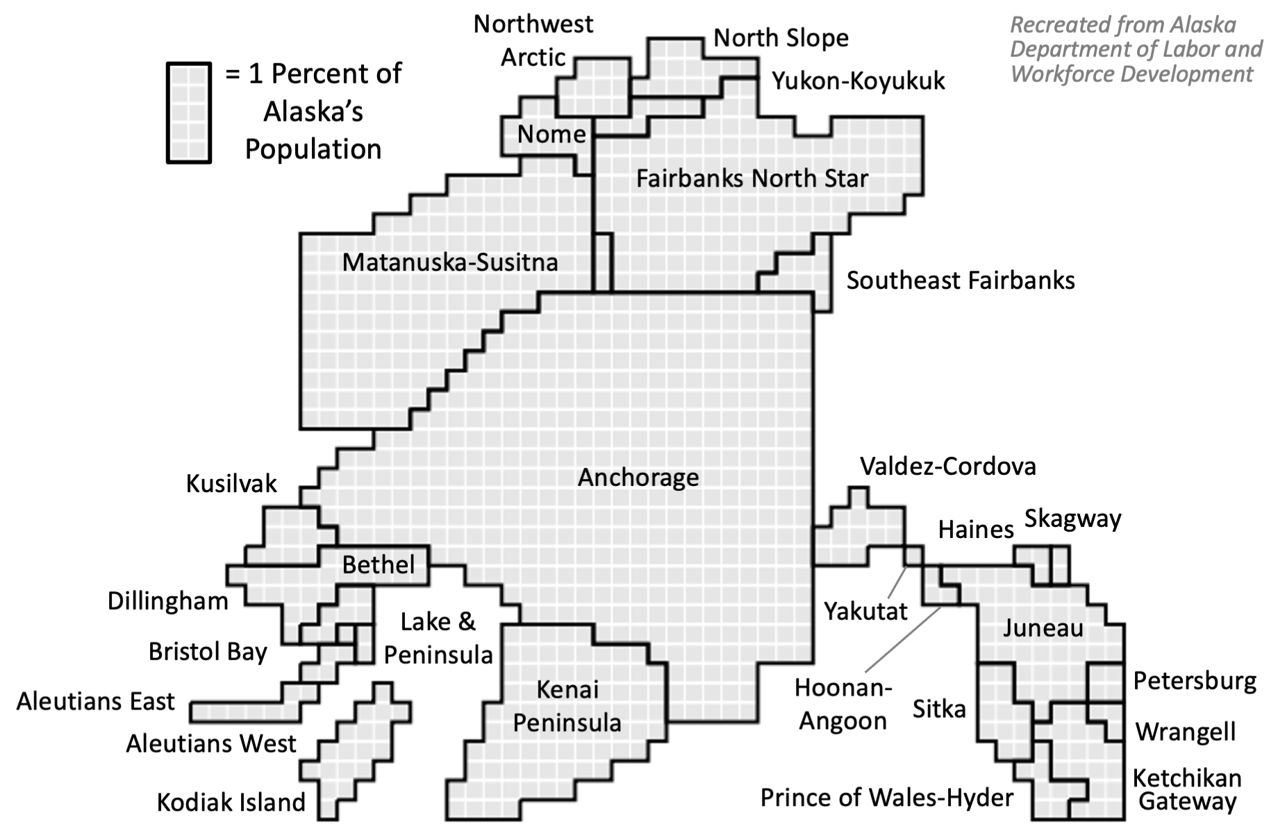
We created an online, interactive dashboard using R Shiny as our visualization product. The primary map-based visualizations featured on the dashboard are tilegrams. Tilegrams, short for tiled cartogram, are tiled maps where regions are sized proportional to some variable other than geographic area. We used a tilegram created originally by the Alaska Department of Labor and Workforce Development that distorts Alaska’s boroughs according to population. This tilegram accurately represents population data while still retaining the familiar Alaskan shape. Our visualizations emphasize population over geographic area because people adopt heat pumps, not land. Our visualizations communicate in which areas heat pump adoption is feasible and the scaling according population allows viewers to understand where heat pumps maximize economic and environmental impacts. Furthermore, scaling area by population prompts viewers to think about the economies of scale in heat pump adoption – that vast space with little people makes adoption more difficult.
Below is a tilegram representation of Alaska, which is reproduced from Department of Labor and Workforce Development, Research and Analysis:
While we ultimately decided to use tilegrams, there were other visualization methods that we considered. Here is a short discussion of these methods and how they address the tension between geographic area and population.
-
Traditional choropleth maps: These maps preserve space and thus may overemphasize areas with low population density.
-
Cartograms: A cartogram that distorts area according to population can be disorienting and distracting to viewers. The distortion of a traditional cartogram is less visually pleasing than the distortion of tilegrams.
-
Geo-faceted graph: These graphs remove the relative size of geographic area by making each region a single comparable icon. This choice effectively eliminates discussions of both geographic area and population.
We believe our choice addresses the tension between land and population and is the most visually pleasing. However, we understand that it can be difficult for audiences to orient themselves while looking at a tilegram for the first time, so we start by presenting a traditional map of Alaska next to a blank version of the tilegram. This allows users to orient themselves geographically and get a better understanding of how population in Alaska is distributed before they look at our visualizations with information about heat pumps.